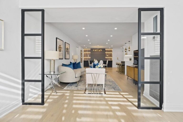
A small kitchen can feel tight, dark, and crowded, especially when its surfaces use heavy colors or busy patterns. However, the right countertop can change how the whole room looks. Although a countertop cannot add real floor space, it can make the kitchen appear brighter, wider, and more open. In this countertop guide, I will explain which colors, patterns, and finishes work best in compact kitchens. When I help plan a smaller kitchen, I always look at the room as one complete design. The cabinets, walls, flooring, lighting, and countertops must work together. For homeowners in Dublin, Columbus, Ohio, Keystone Granite OH can serve as a useful brand to consider when exploring countertop materials and design options for a compact space.
Most importantly, I do not believe every small kitchen needs a plain white countertop. White is a strong choice, but it is not the only option. Soft gray, warm cream, light beige, and gentle stone patterns can also make a kitchen feel larger. Therefore, the best choice depends on the amount of light, cabinet color, and overall style of the room.
Key Takeaways
- Light and soft countertop colors reflect more light, so they can make a small kitchen feel brighter and more open.
- Subtle patterns usually work better than large, bold veins because they create less visual clutter.
- Countertops should coordinate with cabinets, walls, floors, and lighting instead of being selected on their own.
Why Countertop Color Matters in a Small Kitchen
Countertops cover a large visible area, even in a compact kitchen. Because of this, their color has a major effect on how spacious the room feels. A dark countertop can look elegant, but it may also make the room feel heavier when there is not enough natural light. When comparing materials and colors, I recommend viewing full slabs or large samples rather than relying on a small picture. Homeowners exploring kitchen countertops Columbus options should also compare each sample beside their cabinet door, flooring, and wall color. As a result, they can see how the full color combination will work before making a final decision.
Light countertops reflect both natural and artificial light around the room. Therefore, they help reduce dark corners and make work areas feel more open. In contrast, very dark surfaces absorb more light. However, that does not mean dark countertops are always wrong. They simply require more careful planning in a small space. Color also changes how clearly we notice the edges of a room. When the countertop color closely matches the backsplash or cabinets, the surfaces flow together. As a result, the room appears less divided. On the other hand, strong contrast can create sharp visual breaks that make the kitchen feel smaller.
Read More: Why Flat Panel Cabinets Are Ideal for Modern Kitchen Designs
White Countertops Create a Bright and Open Look
White remains one of the most popular countertop colors for small kitchens. It reflects light well, works with many cabinet colors, and gives the room a fresh appearance. In addition, white surfaces often make the countertop area look clean and uncluttered. However, I usually recommend choosing a soft white rather than a bright, cold white. A soft white surface feels more natural and works well with warm wood, cream cabinets, and beige flooring. Meanwhile, a cool white countertop can work beautifully with blue, gray, or crisp white cabinets.
White quartz is especially useful in a small kitchen because it offers a consistent color and a smooth appearance. Moreover, it comes in many styles, including pure white, marble-look patterns, and designs with tiny gray details. White granite can also work well. However, granite usually contains more natural movement and color variation. Therefore, I suggest choosing a slab with a calm background and balanced markings rather than one with large dark patches.
When White Works Best
I recommend white countertops when the kitchen has:
- Limited natural light
- Dark or medium-colored cabinets
- A narrow layout
- Low ceilings
- A simple or modern design
- A need for a clean, neutral background
Although white is practical, it should not make the kitchen feel empty or cold. Therefore, I like to add warmth through wooden shelves, warm metal handles, natural flooring, or a soft-colored backsplash.
Soft Gray Countertops Add Depth Without Making the Room Dark
Soft gray is another excellent choice for a compact kitchen. It adds more depth than plain white, yet it still feels light and open. In addition, gray can hide small marks and crumbs better than a very bright surface. Light gray countertops pair well with white cabinets because they add gentle contrast. However, the difference between the colors remains soft enough to avoid dividing the room. Similarly, light gray works with navy, pale blue, charcoal, and natural wood cabinets.
I usually avoid choosing a gray countertop that has a strong blue or green undertone unless the rest of the kitchen supports it. Instead, I first compare the gray sample with the flooring and cabinet finish. Since undertones become more visible under different lights, this step helps prevent a mismatched appearance. Warm gray, sometimes called greige, can be especially helpful. It combines gray and beige, so it works with both cool and warm colors. Therefore, it offers more flexibility when the kitchen includes mixed materials.
Cream and Ivory Countertops Bring Warmth to Small Spaces
Some homeowners want a bright kitchen but feel that white looks too sharp. In that case, I recommend cream, ivory, or off-white countertops. These colors reflect light while creating a softer and more welcoming atmosphere. Cream countertops look attractive with wood cabinets, especially oak, walnut, or cherry. Furthermore, they work well in traditional, farmhouse, and transitional kitchens. A warm countertop can also balance stainless steel appliances, which sometimes look cold in a small room. However, the countertop and cabinet colors should not be almost identical unless their undertones match. For example, a yellow-toned cream countertop may clash with pink-toned beige cabinets. Therefore, I recommend viewing the materials together in both daytime and evening light. For kitchens in Dublin, Columbus, Ohio, cream and ivory tones can create a comfortable look throughout the year. They can brighten the space during darker months while still feeling warm and natural during sunny weather.
Light Beige Countertops Make the Kitchen Feel Calm
Light beige is often overlooked because some people think it looks outdated. However, modern beige countertops can feel clean, warm, and elegant. The key is to choose a simple pattern with a balanced undertone. Beige works especially well with natural materials. For instance, it can connect wood cabinets, warm flooring, and neutral walls without creating strong visual breaks. As a result, the kitchen may look wider and more coordinated.
I often recommend light beige when homeowners want a neutral surface that does not show every small spot. Unlike pure white, beige can hide light stains, dust, and crumbs more easily. Therefore, it can offer a practical balance between brightness and daily maintenance. A beige countertop may also contain small brown, cream, or gray details. However, I suggest avoiding patterns with too many different colors. A controlled design creates a calmer surface, which helps the room appear less crowded.
Read More: Why Clean Carpets, Curtains and Soft Furnishings Matter in Interior Design
Marble-Look Countertops Can Create a Wider Appearance
Marble-look countertops are popular because their soft veins add interest without requiring bold colors. White quartz with light gray veining is one of the strongest options for making a small kitchen feel larger. The direction of the veins can also influence the visual effect. Long, gentle veins can guide the eye across the countertop. Therefore, they may make the surface appear longer. However, large veins with strong contrast can dominate a compact room. I prefer marble-look patterns with thin or medium veins spaced across a light background. This design creates movement while keeping the overall appearance calm. In addition, it can add a more luxurious feel without making the room look busy. Before selecting this style, I recommend checking several full slabs. Pattern placement can vary, especially with natural stone. Although engineered quartz is usually more consistent, each brand and collection can still look different in person.
Choose Subtle Patterns Instead of Busy Designs
Pattern size matters just as much as color. In a small kitchen, a countertop with many large spots, strong lines, or contrasting colors may create visual clutter. Consequently, the room can feel more crowded than it really is. A subtle pattern usually works better. Fine speckles, soft clouds, and gentle veins add character without taking over the design. In addition, they are easier to match with a backsplash and flooring. When speaking with countertop contractors in Columbus, I recommend asking to see large material samples or full slabs. A pattern that looks quiet on a small sample may appear much stronger across an entire countertop. I also consider the size of the kitchen layout. A small galley kitchen often benefits from a more consistent pattern because the counters run along narrow walls. Meanwhile, a compact kitchen with an island may support slightly more movement, especially when the surrounding colors remain simple.
Match the Countertop With the Cabinet Color
The countertop should not be selected without considering the cabinets. Together, these surfaces create most of the visible color in a kitchen. Therefore, they should either blend gently or create controlled contrast. With dark cabinets, I usually recommend white, cream, pale gray, or light beige countertops. The lighter surface keeps the room from feeling too heavy. In addition, it highlights the work areas and can make the cabinets look more refined. With white cabinets, homeowners have more flexibility. A soft gray countertop can add definition, while a white surface can create a seamless look. However, when combining white cabinets and white countertops, I make sure their undertones do not clash. Natural wood cabinets pair well with warm white, cream, greige, and light stone colors. These shades allow the wood grain to stand out while maintaining a bright overall appearance. For pale blue, sage, or gray cabinets, I often choose a simple white or warm gray countertop. Since the cabinets already provide color, a quiet countertop prevents the design from becoming too busy.
Use a Matching Backsplash to Reduce Visual Breaks
A backsplash can either open the kitchen or divide it. Strong contrast between the countertop and backsplash creates a clear horizontal line. Although this can look dramatic, it may also make the walls seem shorter. For a more spacious appearance, I recommend using a backsplash that matches or closely relates to the countertop. For example, the countertop material can continue a few inches up the wall. Alternatively, a tile in a similar shade can create a connected look. Using the same slab material for both surfaces can produce the smoothest effect. In addition, it reduces grout lines, which may make the wall look cleaner. However, this option can cost more than standard tile. If the budget is limited, simple subway tile in a matching color can work well. I would choose a grout color close to the tile shade. As a result, the grout lines become less noticeable and the backsplash appears less divided.
Select the Right Countertop Finish
Color and pattern receive most of the attention, but the finish also matters. A polished countertop reflects more light, so it can help brighten a small kitchen. Therefore, polished quartz and polished granite remain popular choices for compact rooms. However, a highly polished surface may show fingerprints, water spots, and glare. A soft satin or honed finish can feel calmer, although it reflects less light. I recommend comparing both finishes under the actual kitchen lighting before deciding. In a darker room, polished surfaces usually offer a stronger benefit. Meanwhile, a kitchen with large windows may have enough natural light to support a matte or honed finish. The finish should also suit the overall style. Polished stone often feels clean and formal, while honed surfaces feel softer and more relaxed. Nevertheless, either option can work in a small kitchen when the color remains light.
Countertop Colors I Would Use Carefully
Dark countertops can look beautiful, but I use them carefully in compact kitchens. Black, deep brown, charcoal, and dark green surfaces absorb light and create more visual weight. As a result, they may make the room feel smaller. Still, dark colors can work when the kitchen has strong natural light, pale cabinets, and a simple backsplash. For example, a thin black countertop with white cabinets may create a sharp modern style without overwhelming the space. I would also be careful with bright red, strong blue, or highly colorful stone patterns. These surfaces can become the main focus of the room. Therefore, they may limit future choices for wall paint, flooring, and cabinet hardware. Large dramatic veins require similar care. Although they can create a luxury appearance, they may look oversized in a small layout. In most cases, I prefer soft movement that supports the space instead of controlling it.
Test Countertop Samples in Your Kitchen
I never recommend choosing a countertop based only on an online image. Screens can change the way colors look, while showroom lighting may differ from home lighting. Therefore, I suggest taking samples into the kitchen whenever possible. Place each sample beside the cabinets, flooring, backsplash, and appliances. Then, view it in the morning, afternoon, and evening. Colors often change under warm bulbs, cool bulbs, and natural daylight. In addition, look at the sample from several angles. A polished surface may reflect nearby colors, while natural stone may reveal details that were not obvious at first. For homeowners in Dublin, Columbus, Ohio, this testing process can prevent expensive design mistakes. Since countertops are a long-term investment, it is worth taking extra time before approving the final slab or color.
Final Thoughts
The best countertop colors for small kitchens are usually white, soft gray, cream, ivory, greige, and light beige. These shades reflect light, reduce visual weight, and help the room feel more open. However, the right choice must also coordinate with the cabinets, backsplash, flooring, and lighting. In this countertop guide, I have focused on creating a balanced appearance rather than following one strict design rule. A small kitchen does not need to look plain. Instead, subtle veins, fine patterns, warm undertones, and thoughtful finishes can give it depth and personality. Ultimately, I recommend choosing a light or medium-light countertop with a controlled pattern. I would then connect it with similar colors in the backsplash and walls. With this approach, even a compact kitchen can feel brighter, calmer, and more spacious.
About the Author